top of page

NEWTEK BANK
what it is
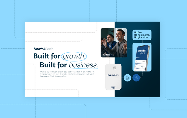
Rebrand pitch project with five brand art options to help the client choose a direction for their visual language.
All work displayed here was created as part of my role at Highwater Agency. All rights to the work remain with Highwater Agency.
challenge
Maintain certain visual elements of the parent brand (navy blue and logo) while creating a unique identity for the new brand vertical of banking solutions for small businesses.
process
Brief
Brainstorm
Research
Design
Presentation


CONCEPT 1
This concept includes bold, modern typography to communicate the brand’s forward-thinking, yet grounded, approach to banking. Exuding with a confident and punchy tone.
CONCEPT 2
The goal with this concept was to create a clean and warm feeling to reiterate Newtek Bank's position as not just a financial institution, but a dedicated ally for small business owners, promoting growth, flexibility, and transparency.
CONCEPT 3
This concept explores a monotone color schemes that closely reflects the parent brand while creating a new sense of approachability balanced with professionalism and community.

CONCEPT 4
This concept combines sleek, contemporary elements using a versatile modular design. This creates subtle nods to stability and trust, emphasizing Newtek’s role as a reliable financial partner for entrepreneurs.

CONCEPT 5
A concept that uses color psychology to correlate the brand with wealth and success. The confident copy and photography reiterate the brand's message of "We know the industry and we know what's best, so grow with us."

bottom of page


